The U.S. Senate is the “greatest deliberative body in the world”. A common phrase last used by Chief Justice John Roberts during the Impeachment Trial. But what does the data say?
I am not aware of a measure that looks at individual parliamentary bodies but V-Dem has expert ratings on the deliberative quality of political elites by country, which may serve as a proxy.
Packages
First, let’s load some necessary packages.
# Install these packages if you don't have them yet
# if (!require("pacman")) install.packages("pacman")
# devtools::install_github("favstats/tidytemplate")

pacman::p_load(tidyverse, tidytemplate, ggtext)
Load Data
Let’s load in the V-Dem data.
vdem <- readr::read_rds("data/V-Dem-CY-Full+Others-v9.rds")
So what does the data say? There are many sub-dimensions to deliberation but here we are going to focus on one of them: “respecting counter-arguments”.

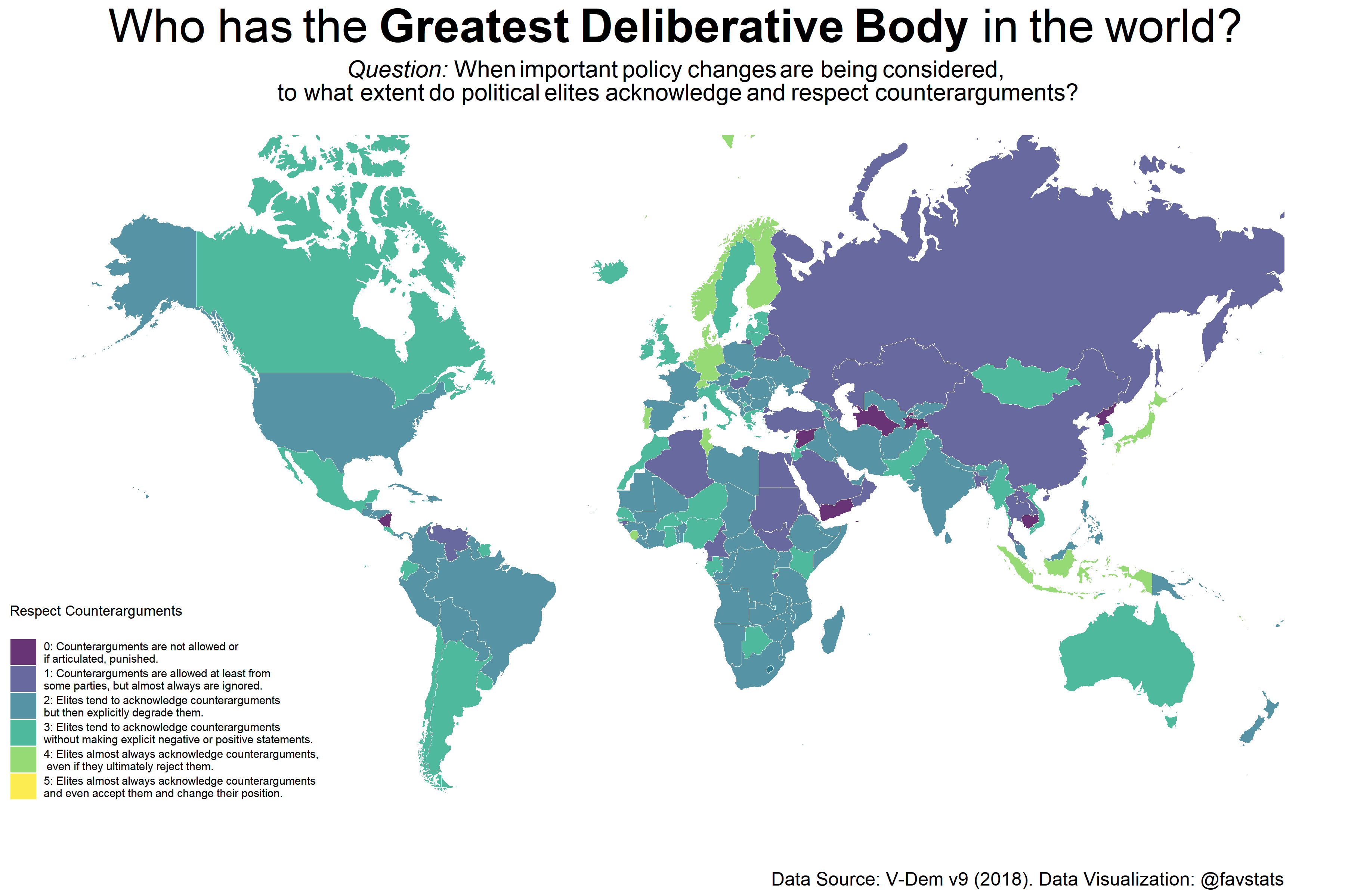
A map of the most recent data (2018) reveals that the US is not the “greatest” when it comes to deliberation.
world_dat <- ggplot2::map_data("world")


delib_map <- vdem %>%
  filter(year == 2018) %>%
  mutate(v2dlcountr = v2dlcountr_mean) %>%
  select(v2dlcountr, country_name, year) %>%
  mutate(v2dlcountr = round(v2dlcountr) %>% as.factor) %>%
  mutate(region = countrycode::countrycode(country_name, "country.name", "country.name")) %>%
  right_join(
    world_dat %>%
      mutate(region = countrycode::countrycode(region, "country.name", "country.name"))
    )


delib_map %>%
  # filter(is.na(v2dlcountr)) %>%
  filter(region != "Antarctica") %>%
  filter(region != "Greenland") %>%
  arrange(desc(v2dlcountr)) %>%
  ggplot(aes(long, lat)) +
  geom_polygon(aes( group = group, fill = v2dlcountr),
               color = "white", alpha = 0.8, size = 0.2) +
  ggthemes::theme_map() +
  scale_fill_viridis_d("Respect Counterarguments\n",
                       breaks = 0:5,
                       limits = c(0,1, 2,3,4, 5),
                       labels = c(
                         "0: Counterarguments are not allowed or\nif articulated, punished.",
                         "1: Counterarguments are allowed at least from\nsome parties, but almost always are ignored.",
                         "2: Elites tend to acknowledge counterarguments\nbut then explicitly degrade them.",
                         "3: Elites tend to acknowledge counterarguments\nwithout making explicit negative or positive statements.",
                         "4: Elites almost always acknowledge counterarguments,\n even if they ultimately reject them.",
                         "5: Elites almost always acknowledge counterarguments\nand even accept them and change their position."
                         )
                       ) +
  coord_map(xlim=c(-180,180)) +
  labs(title = "Who has the **Greatest Deliberative Body** in the world?",
       subtitle = "*Question:* When important policy changes are being considered,<br>to what extent do political elites acknowledge and respect counterarguments?<br>",
    caption = "Data Source: V-Dem v9 (2018). Data Visualization: @favstats") +
  theme(
        plot.title = element_markdown(color = "black",
                                  size = 30, hjust = 0.5),
        plot.subtitle = element_markdown(color = "black",
                                  size = 15, hjust = 0.5),
        plot.caption = element_text(size = 12),
        legend.position = c(-0.05, 0.075),
    legend.background = element_blank(),
    legend.box.background = element_blank(),
    legend.key = element_blank()
  ) #+ guides(fill = guide_colourbar(barheight = 12))

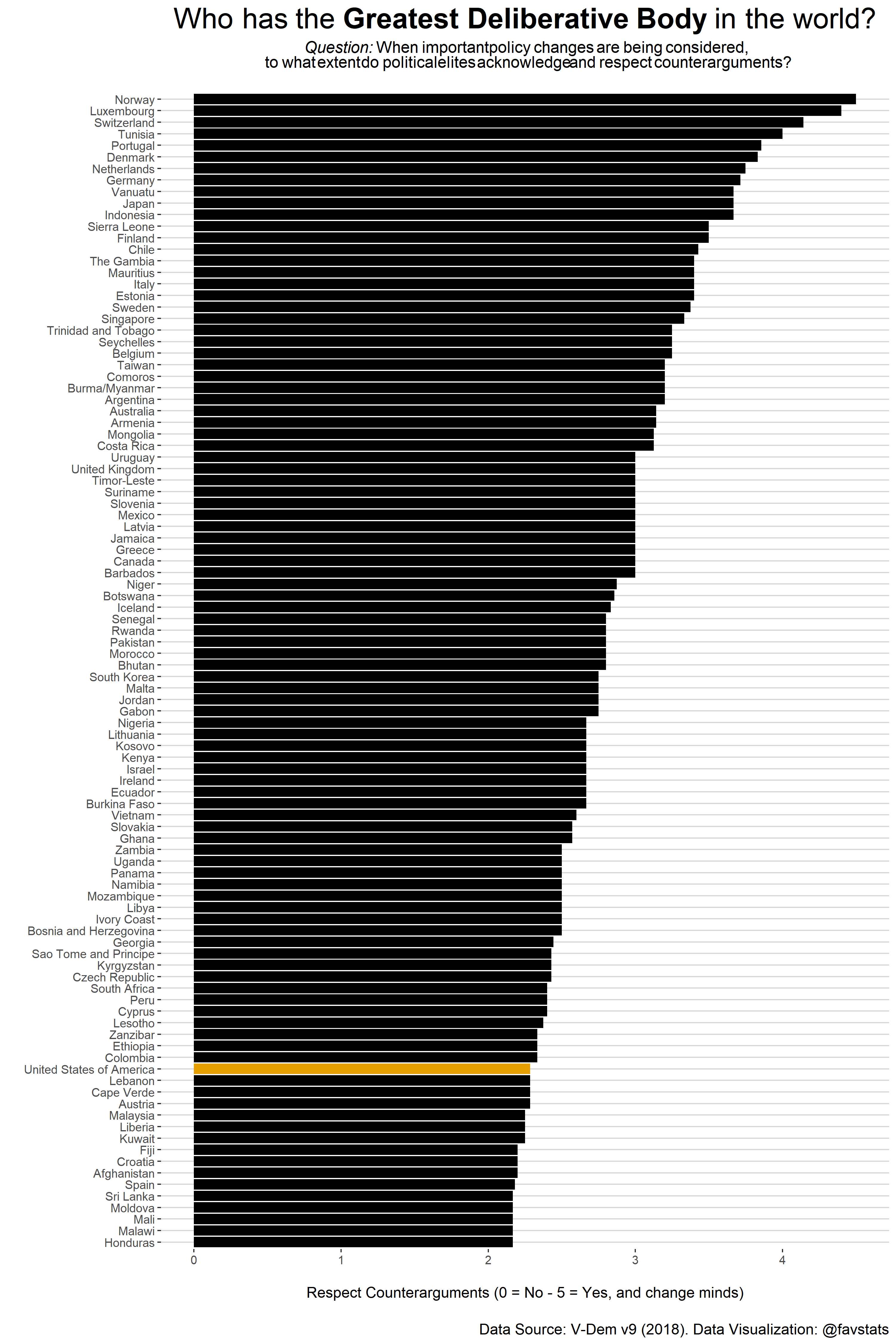
In fact, we have to plot the 100 most deliberative countries in order to even reach the United States on this scale which is rank at 88th place (!). The US ranks more poorly on respecting counterarguments than most European and many developing countries. Why is that the case?
vdem %>%
  select(v2dlcountr_mean, country_name, year) %>%
  filter(year == 2018) %>%
  arrange(desc(v2dlcountr_mean)) %>%
  slice(1:100) %>%
  mutate(label = ifelse(country_name %in% c("United States of America"), "US", "not us")) %>%
  mutate(country_name = fct_reorder(country_name, v2dlcountr_mean)) %>%
  ggplot(aes(country_name, v2dlcountr_mean, fill = label)) +
  geom_col() +
  coord_flip() +
  ggthemes::theme_hc()  +
  ggthemes::scale_fill_colorblind()  +
  labs(title = "Who has the **Greatest Deliberative Body** in the world?",
       subtitle = "*Question:* When important policy changes are being considered,<br>to what extent do political elites acknowledge and respect counterarguments?<br>",
    caption = "\nData Source: V-Dem v9 (2018). Data Visualization: @favstats", x = "", y = "\nRespect Counterarguments (0 = No - 5 = Yes, and change minds)") +
  theme(
        plot.title = element_markdown(color = "black",
                                  size = 23, hjust = 0.5),
        plot.subtitle = element_markdown(color = "black",
                                  size = 13, hjust = 0.5),
        plot.caption = element_text(size = 12),
        legend.position = "none"
  )

Looking at the data over time may allow us some insights. We can see that the US was actually at a highpoint in 2012.. but 2017 and 2018 have seen the lowest score ever assigned to the US Since 1900 (!). One may argue that the election 2016 may have something to do with this.
cntry_list <- c("United States", "Norway", "Russia", "Germany", "Israel")

label_dat <- vdem %>% filter(year == 2018) %>%
                              mutate(country_name = ifelse(country_name == "United States of America", "United States", country_name)) %>%
                              filter(country_name %in% cntry_list)

vdem  %>%
  mutate(country_name = ifelse(country_name == "United States of America", "United States", country_name)) %>%
  select(v2dlcountr_mean, country_name, year) %>%
  ggplot(aes(year, v2dlcountr_mean, group = country_name)) +
  geom_step(color = "lightgrey", alpha = 0.5) +
  geom_step(data = vdem %>%
                mutate(country_name = ifelse(country_name == "United States of America", "United States", country_name)) %>%
              filter(country_name %in% cntry_list), aes(color = country_name), size = 1.2) +
  ggthemes::theme_hc() +
  scale_x_continuous(breaks = c(1900, 1925, 1950, 1975, 2000, 2018), limits = c(1900, 2024)) +
  ggthemes::scale_color_colorblind("Country")  +
  labs(title = "Who has the **Greatest Deliberative Body** in the world?",
       subtitle = "*Question:* When important policy changes are being considered,<br>to what extent do political elites acknowledge and respect counterarguments?",
    caption = "\nData Source: V-Dem v9 (2018). Data Visualization: @favstats", x = "", y = "Respect Counterarguments (0 = No - 5 = Yes, and change minds)\n") +
  theme(
        plot.title = element_markdown(color = "black",
                                  size = 30, hjust = 0.5),
        plot.subtitle = element_markdown(color = "black",
                                  size = 15, hjust = 0.5),
        plot.caption = element_text(size = 12),
        legend.position = "none"
  ) +
  geom_text(data = label_dat, aes(x = 2018.5, color = country_name,label = country_name), hjust = 0)  +
  ylim(0, 5)

Looking at the data over time may allow us some insights. We can see that the US was actually at a highpoint in 2012.. but 2017 and 2018 have seen the lowest score ever assigned to the US Since 1900 (!). One may argue that the election 2016 may have something to do with this.
